总字数 1.4k
预计阅读时间 6 分钟
常用的居中方法
- 水平居中对于子元素的不同情况 , 需要进行不同的处理
1
2
3<div class="parent">
<div class="child"></div>
</div>
- 行内元素 : 对父元素设置
text-align:center - 定宽的块元素 : 对子元素设置
margin-left:auto以及margin-right:auto - 不定宽的块元素 : 可以把子元素转化为行内元素 , 然后使用行内元素的方案 , 对子元素设置
display: inline, 对父元素设置text-align:center
通用方案
使用flex布局 , 对父元素设置
1 | .parent { |
- 垂直居中
垂直居中的情况通常是父元素的高度固定 , 以下是在此前提下实现的
- 子元素为块元素 : 设置子元素
position:absolute, 然后margin:auto - 子元素为单行内联文本 : 父元素的
height与line-height相同即可 - 子元素为多行内联文本 : 父元素
display:table-cell, 再设置vertical-align:middle
例如1
2
3
4
5
6
7
8
9
10
11
12
13<div class="parent">
<p>123456</p>
<p>123456</p>
<p>123456</p>
</div>
<style>
.parent {
height:200px;
width:300px;
display:table-cell;
vertical-align:middle;
}
</style>
通用方案
使用flex布局 , 父元素
1 | .parent { |
单列布局
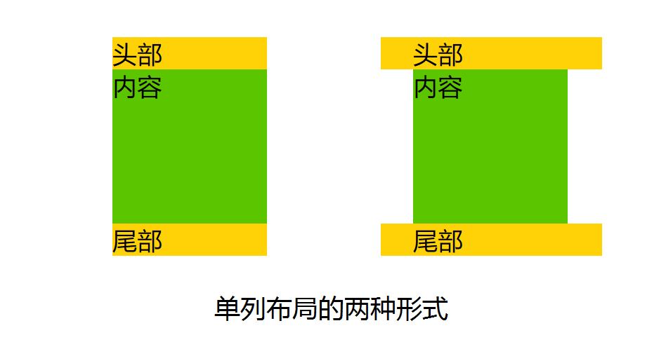
第一种布局方式DOM结构
1 | <div class="layout"> |
第二种布局方式DOM结构
1 | <div class="header"> |
样式
1 | .layout { |
多列布局
可能有以下各种情况 , 当然如果更多列的话也是类似的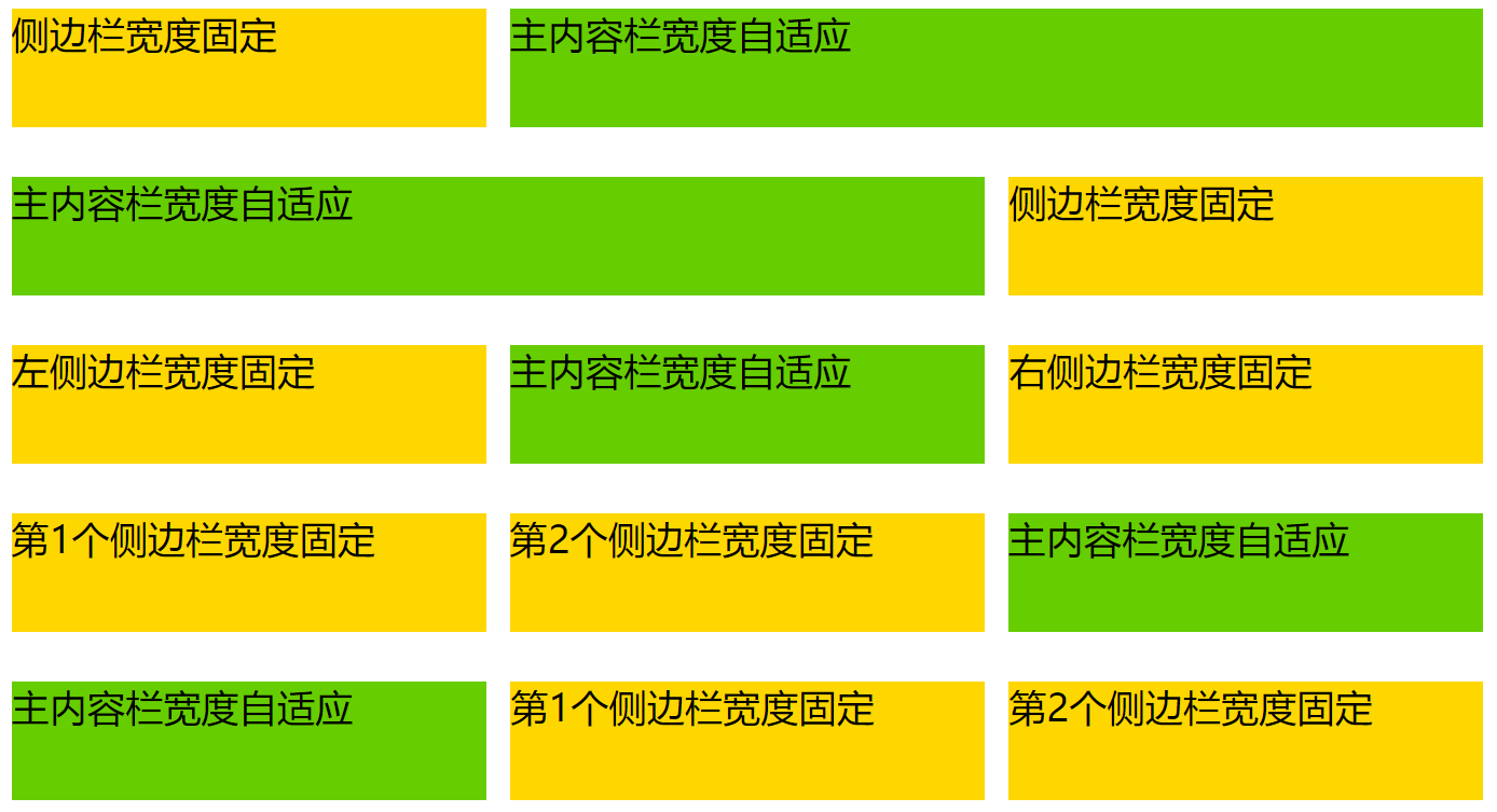
实现方式1 : float+margin
DOM结构
1 | <div class="content"> |
CSS样式
1 | .sub,.extra,.main { |
实际效果如下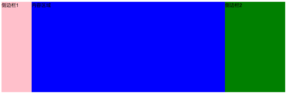
注意 : DOM文档的书写顺序,先写两侧栏,再写主面板,更换后则侧栏会被挤到下一列
这种布局方式比较简单明了 , 缺点是渲染时首先渲染了侧边栏 , 而不是重要的内容区域
实现方式2 : position+margin
- 对两个侧边栏分别设置宽度
- 将两个侧边栏设置为绝对定位 , 需要位于左侧的left值为0 , 位于右侧的right值为0
- 内容区域设置左外边距和右外边距
1
2
3
4
5
6
7
8
9
10
11
12
13
14
15
16
17
18
19
20
21.sub,.extra,.main {
height : 300px;
}
.sub,.extra {
position: absolute;
top : 0;
width : 200px;
}
.sub {
left : 0;
background-color: pink;
}
.extra {
right : 0;
background-color: green;
}
.main {
margin:0 200px;
backgroun-color: blue;
}如果中间栏有最小宽度限制 , 或者其中包含有宽度的元素 , 那么当窗口宽度压缩到一定程度 , 中间栏与侧栏将会发生重叠
实现方式3 : 圣杯布局(float + 负margin + padding + position)
DOM结构
1 | <div id="content"> |
布局步骤:
- 三者都设置向左浮动。
- 设置main宽度为100%,设置两侧栏的宽度。
- 设置 负边距,sub设置负左边距为100%,extra设置负左边距为负的自身宽度。
- 设置main的padding值给左右两个子面板留出空间。
- 设置两个子面板为相对定位,sub的left值为负的sub宽度,extra的right值为负的extra宽度。
CSS样式
1 | .sub , .extra, .main { |
这种布局方式仍然存在一个缺陷 : 当main的实际宽度比侧边栏的宽度小的时候 , 布局就会乱掉
实现方式4 : 双飞翼布局(float + 负margin + margin)
双飞翼布局实际上是在圣杯布局的基础上做了改进 , 在main部分的外层套上了一层div
并设置margin,由于两侧栏的负边距都是相对于main-wrap而言,main的margin值变化便不会影响两个侧栏,因此省掉了对两侧栏设置相对布局的步骤
DOM结构
1 | <div class="main-wrap" > |
布局步骤
- 三者都设置向左浮动。
- 设置main-wrap宽度为100%,设置两个侧栏的宽度。
- 设置 负边距,sub设置负左边距为100%,extra设置负左边距为负的自身宽度。
- 设置main的margin值给左右两个子面板留出空间。
CSS样式
1 | .main-wrap, .sub, .extra { |