• 主页
  • 归档
  • 分类
  • 照片墙
所有文章 友情链接 关于我

  • 主页
  • 归档
  • 分类
  • 照片墙
  1. 1. 应用场景
    1. 1.1. 多行文字垂直居中
    2. 1.2. 多列等高布局
  2. 2. 兼容性

table-cell应用

2018-06-15 09:23:57
总字数 657
预计阅读时间 2 分钟

table-cell元素让该元素以表格单元格的形式呈现,类似于td标签
单元格有一些比较特别的属性,例如元素的垂直居中对齐,关联伸缩等

table-cell并不是必须和table父元素配套使用 , 但是通常习惯于这样做

table-cell会被某些css样式破坏 , 比如float 绝对定位
对width height padding有反应 , 对margin无反应

1
2
3
4
5
6
7
8
9
10
11
.box {
display:table;
}
.box > .child {
display:table-cell;
background-color:pink;
padding:3px;
width:200px;
height:50px;
margin:6px; /* 不生效 */
}

应用场景

多行文字垂直居中

单行文字的居中十分简单, line-height与父元素的高度相同即可

1
2
3
4
.box {
height: 50px;
line-height: 50px;
}

这里准确地说应该是文字或者全部为内联元素均在一行内

但是如果其中的文字可能有多行并且行数不确定 , 这种办法就不可行了
使用table-cell配合vertical-align: middle就可以很方便做到

1
2
3
4
5
6
7
<div class="box">
<div class="child">我是单行文字</div>
<div class="child">
<div>我是多行文字</div>
<div>我是第二行</div>
</div>
</div>
1
2
3
4
5
6
7
8
9
.box > .child {
display:table-cell;
vertical-align: middle;
text-align:center;
border: 1px solid red;
padding:3px;
width:200px;
height:80px;
}

多行文字垂直居中
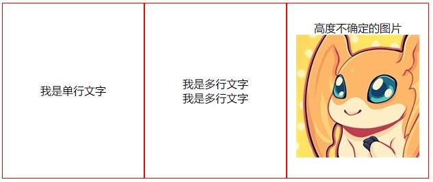
当然水平居中和单行没什么差别 , 都是text-align:center

多列等高布局

对于多列布局 , 当然存在很多的实现方法
但是如果想要让所有列的高度适应于内容最高的一列的高度
源于表格当中 td 的特性
使用table-cell实现起来就更为方便

1
2
3
4
5
6
7
8
9
10
11
12
13
<div class="box">
<div class="child left">我是单行文字</div>
<div class="child middle">
<div>我是多行文字</div>
<div>我是多行文字</div>
</div>
<div class="child right">
<div>我是多行文字</div>
<div>我是多行文字</div>
<div>我是多行文字</div>
<div>我是多行文字</div>
</div>
</div>
1
2
3
4
5
6
7
8
9
10
11
12
13
14
15
.box {
display:table;
width: 760px;
margin: auto;
}
.box > .child {
display:table-cell;
text-align:center;
border: 1px solid red;
padding:3px;
width:200px;
}
.box > .left, .box > .right {
width:20%;
}

多列等高布局
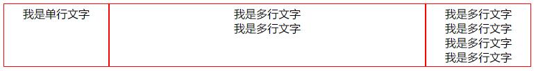
可以看到整体的高度适应于内容最高的右边一列

兼容性

table相关的布局方式在主流浏览器当中都是兼容的

|Chrome|Firefox (Gecko)|Internet Explorer|Opera|Safari (WebKit)|
|—|—|
|1.0 | 1.0 (1.7 or earlier) | 8.0 | 7.0 | 1.0 (85) |

  • 前端
  • css
  • 前端杂烩

扫一扫,分享到微信

3.4、Docker(4)-nginx
Optional 
© 2024 夏夜梦星辰
鲁ICP备19028444号
Power By Hexo
  • 所有文章
  • 友情链接
  • 关于我
{{searchItem.query}}
标签: 分类:
  • maven
  • 持续集成
  • JMS
  • 线程
  • JavaScript
  • ECMAScript6
  • 单元测试
  • Promise
  • Web Worker
  • 函数
  • prototype
  • 模块化
  • 正则表达式
  • 数据库
  • MongoDB
  • 索引
  • 集群
  • 全文检索
  • flutter
  • dart
  • git
  • 版本控制
  • linux
  • shell
  • docker
  • nginx
  • jenkins
  • opencv
  • vim
  • react
  • react native
  • 前端
  • css
  • HTML5
  • Hexo
  • sass
  • Three.js
  • TypeScript
  • Vue
  • 组件化
  • base64
  • webpack
  • nodejs
  • gulp
  • TensorFlow
  • 机器学习
  • 算法
  • 动态规划
  • 数据结构
  • Java
  • JavaScript
  • MongoDB
  • flutter
  • Git
  • linux
  • react
  • 前端杂烩
  • 男生女生
  • 算法
  • 十年饮冰,难凉热血
  • †少女癌†
  • 猫与向日葵
  • coderfun
  • JENKINS
  • API管理后台
愿你最终能接纳每一面每一种的自己
独自活着便是团圆